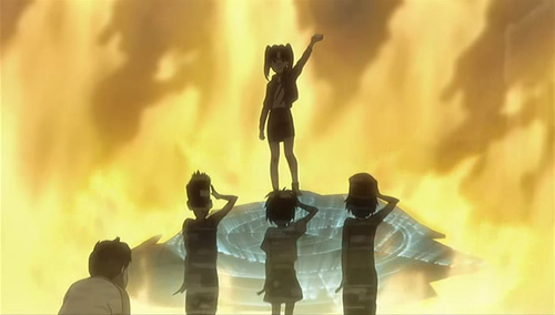
Speaker for the New Layout

by

in

vlcsnap-890134.jpg

It’s nearly 2008, and the new year wouldn’t feel proper without a new look for Bateszi Anime Blog. I’m not sure how long you’ve been visiting (today might be the first time), but I’ve actually been blogging since March 2006 and this new layout is the sixth incarnation of my humble corner of the internet. I wonder, can anyone else remember all those different new looks? Anyway, here’s a quick rundown of what has changed:

  1. At the top of the right menu, you’ll find my shiny new “Article viewer”. Basically, it’s a rather fun “mini-browser” allowing you to quickly guide through my blog archives instead of having to marathon through pages and pages of text. I’m really proud of this, mainly because it is my first ever practical use of AJAX, and hell, it beats constantly scrolling up and down a page.
  2. The other major difference is that I’ve dropped my rather convoluted use of categories and literally classified everything as either a “review” or an “editorial”; anything more specific than that will be separated by tags, the end result of which is my fluffy new “cloud” floating in the footer of the blog. Isn’t she pretty?

That’s about all I wanted to say. I hope you like the new layout. If nothing else, at least it isn’t pink, right? Or green? Anyway, once I’ve caught my breath, normal service will resume with my (or should I say the OFFICIAL) BEST ANIME OF 2007 COUNTDOWN.
20 responses to “Speaker for the New Layout”

  1. hayase Avatar

    It’s very neat. 🙂

  2. super rats Avatar

    The article viewer is a very nice touch.

  3. Outlawstar Avatar
    Outlawstar

    Loving the Eureka/Gurren banner, heres to more great articles in 08.

  4. Hige Avatar
    Hige

    I remember the old skool layouts and I think this is your best yet. Very clean and Web 2.0. Good work 😀

  5. Kabitzin Avatar

    I like how it looks, very clean. The use of AJAX in your sidebar really frees up a lot of space, and it works very well. Nice job!

  6. Martin Avatar
    Martin

    Out of all the layout changes I’ve seen over here I reckon this one works the best – it’s one of the most effective and inventive takes on the old article list/sidebar structure, and as Kabitzin points out the Ajax thing works great. I can only agree that the tag cloud is a great idea (I take it you’ve bitten the bullet and gone for the 2.3 upgrade?) – I didn’t realise how useful and neat it was until I put it into practice. Much better than plain old categories, and more intuitive too.
    Overall it’s really clean and easy on the eyes. Bonus points for increasing the width as well – I doubt many people are restricted to 800×600 resolution any more so it gives more useful space to play around with.
    Good job (Lucky Star reference intentional)! *thumbs up*

  7. IKnight Avatar

    The layout’s nice, or (since I am meant to be a human incarnation of literary pretension) rather the mise-en-écran is aesthetically superb. Bottom of the page suits me as a place for the tag-cloud too.
    I don’t know, all you technical people with your computery-wizardry-stuff. Last time I checked, Ajax was heaving huge rocks around at Troy.

  8. IKnight Avatar

    I evidently forgot to close a tag. Oops.

  9. bateszi Avatar
    bateszi

    Thanks for the nice comments, guys. When I launch these new layouts, I never know what to expect, so it’s good to put my mind to rest (I’m glad you’ll never know just how many hours I spent scrutinizing every damn pixel on this page).
    @Martin: Yup, I’ve finally updated all the way to Version 2.3.1. It was actually a lot easier than I expected (not including that whole UTF change-over).
    @IKnight: If you going for wordy pretension, you’ll find an equal in Michael over at anime|otaku. He is a wordsmith of the highest order.
    If anyone else has any comments, good or bad, fire away 🙂

  10. Iio Avatar
    Iio

    Even I like this new layout, and I am notoriously picky about website design.
    Please keep it for more than 3 weeks. 😛
    And I almost stopped visiting your otherwise excellent blog when you first unveiled that pink monstrosity a while back. 😛

  11. berkles Avatar
    berkles

    Yeah i come here and read this blog a lot but never comment on it, so let me just say I thoroughly enjoy your reviews.
    as for the new design i like it…not as much as the previous one..but better than that pink one
    keep up the good work

  12. Nekonron Avatar
    Nekonron

    Great new layout. Simple, clean and very functional. I like how you removed all the clutters and only leaving behind what people actually make use of. Think it’s about time I switch to tag clouds, too 😀

  13. Michael Avatar
    Michael

    Oh snap! I got my name mentioned! D:
    This layout is great, bateszi (or Paul) :p. I wish I were as literate as you when it comes to putting ostentation to my blog layout. 😀

  14. MK Avatar
    MK

    Nice! I really like the use of tags in the footer. I think that’s great use of the space.

  15. bateszi Avatar
    bateszi

    @Iio: I think this one will be sticking around for a good few months. Also, can’t help but chuckle when I read your comments on the pink layout; at the time I thought it was alright, though looking back on it now, it’s probably the most bizarre colour scheme I’ve ever used.
    @berkles: I’ve visited your blog a few times since I had a few referrals from your blog-roll. I’m glad you commented, now I have a name to put to the odd mixture of philosophy, politics and anime! 🙂
    Anyway, everyone, cheers for all the positive comments, especially with regards to the placement of the tag-cloud. I stuck it down there because I figured it’s most likely to catch attention once someone finishes reading an article or comments. I really wanted this whole revamp take things back to basics.
    Also, if anyone else out there has any comments (good, bad or random), please do keep them coming. It’s fascinating reading what you make of these changes.

  16. maya Avatar
    maya

    Did you create this layout yourself? I’m an aspiring graphic/web designer (taking classes for it finally), and I think you did an amazing job on it. I love the banner especially. The blog looks inviting, clean, and welcoming. I really do hope to be just as talented as you someday. 🙂

  17. bateszi Avatar
    bateszi

    Hi maya. Thanks for really nice comment, I’m glad you like it. And yup, the layout and graphics are all mine (though the actual anime images are from a wallpaper). I’d be interested to see some of your web designs if you’ve created any?

  18. Animated FatCat Avatar
    Animated FatCat

    Looks Great!

  19. That Girl Hates You Avatar
    That Girl Hates You

    Love the new layout. Clean, simple yet complicated, and navigating around it is easy. Just some opinions from my web designer mind ><.

  20. bateszi Avatar
    bateszi

    Thanks 🙂 Typical that on my first morning back at work, I’d discover a major bug in the CSS with IE7 (I’ve been testing it with IE6/Firefox at home). Should be all fixed now, I think.

Leave a Reply

Your email address will not be published. Required fields are marked *