In what ended up being one of the cooler mornings I’ve had recently, I stumbled upon Koji Morimoto’s Attraction via twitter. Not knowing what to expect, but hearing it paired with the words “interactive anime”, I clicked.
What followed was one of Studio 4C’s latest experiments with the anime medium. Their involvement with the upcoming (and looking stellar) Catherine action/adventure game by Atlus has been highly profiled, but Attraction seems to have slipped under the lens of most anime fans. It’s a pity, too. While it is about a rather done-to-death topic (the perils of smoking) and, in the end is a public service announcement for the French Government, there’s lots of cool things going on with this that should be brought to attention.

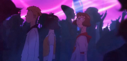
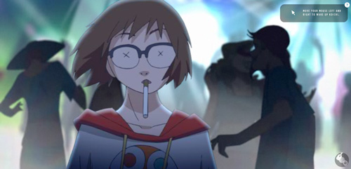
At it’s core, Attraction spreads an important, but essential message: “Tobacco attracts more customers each year. Don’t be fooled.” However, instead of taking the trite route of kids messing around with cigarettes, Morimoto explodes the whole scenario into something almost entirely abstract. After having attained the latest lighter (as promoted by a sultry, smoking model) a trio of kids innnocently set out to see what it can do. They wind up in a password-protected, seedy basement club, where, as tempted by the sultry model in person, the two boys are led into smoking.

Normally I find interactive ‘old’ media if you will – television, books, and anime – to be either rudimentary in their execution, or otherwise of low quality. I am happy to say that Attraction is not. This is a hard little ‘game’ to play if you will. 4C’s excellent creation of a club setting (particularly that of the strobing, pulsating lights) make it often impossible to complete the task at hand. Not distracting, mind you, but simply about as frustrating as trying to do anything in a club generally is.


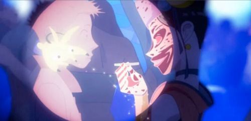
There’s something very palpable and engaging about Attraction that even some video games don’t offer. Moreover, its interactions are well-crafted. The scene where Ren, the lone female of the trio, has to wake her friends from their cigarette-induced hypnosises is incredibly well-animated. I suspect the fact that these interactive stories have improved in quality has much to do with the passage of time, and the improvement of technology in that regard – simply put, my parent’s computer couldn’t handle Attraction. But mine can, so lucky me!
The only thing about Attraction which strikes me as being a pity is its length. It finishes in under 10 minutes (possibly longer, depending on how long you take to defeat the evil boss of the club; which, frankly, took me longer than I think was intended). For something so beautiful and so well-crafted, I can’t help but want more. I hope the ever-experimental Studio 4C will produce more shorts like Attraction in future, though, as the evolution of anime is something I’m always keenly interested in.
A fatal Attraction
6 responses to “A fatal Attraction”
-
This was a very interesting experiment. In fact, it’s precisely what I would expect from a “visual novel.” As soon as I saw Morimoto’s name pop-up in the opening credits, I was excited, and given I’d clicked into it completely blind, I had no idea it was an anti-smoking ‘thing’ right up until the message pops-out at you in the end. Rather, I was more immersed in the story and the various interactions required; some of interactions were more successful than the others (I really liked the coloured password bit and the shaking of the boy, but some others felt a bit more ‘bull in a china shop’, particularly the last two things– but perhaps that was the point?) but it was just great to see such a lovely 4C short with Morimoto again, they are so few and far between, but so interesting none the less! 🙂
-
One of the things I remember best about Koji Morimoto is the amount he smoked in the Memories/Animatrix interviews…..both of which are fairly old at this point, so he could have easily quit since then. Although some (potentially sick) part of me can’t help but get a kick at the visual image of him working on this in between puffs of smoke.
Also digging the (umpteenth) site redesign.-
Japan has one of the highest populations of smokers in the world. It’s a fairly common, if deadly habit in Asia. Though you’re right, the irony of Koji Morimoto doing something like this is quite humorous 🙂
Thanks for the compliment. I did the design and bateszi did the code. A team effort!
-
-
I’m not sure if I’d call this a “visual novel” – A novel, to me, is something that should be read, and this very much something to be watched.
I agree that some of the interactions were more successful than others – surprisingly though, I found the opposite of you. The colour thing confuses me a little bit (I think I ended up just clicking at random intervals) but I loved the shaking part; the animation was so fluid and nice, and it was great to see the halo of light around the boy pulsate in time with the music, moreover the speed at which you moved the mouse back and forth affected the interaction – if you shook slowly, you heard the girl telling him to snap out of it, if you shook faster, he woke up. It’s nice to see that they’ve incorporated more than basic click interactions, though, and they’ve done it in a somewhat meaningful way.
-
-
Thanks for this! Always interested in Studio 4C.
-
That was kind of amazing. Reminds me of something Doritos (another totally unexpected source for something this experimental , technically impressive, and quite frankly cool) did a while ago (http://hotel626.com/). It is an interactive horror game that actually was high on immersion (the first requirement is that you have a webcam and play at midnight , unless you change your system’s clock).
Of course the draw here is Studio 4C’s beautiful animation and unique implementation of flash based technology. It is a total crime its so short , but I can understand its probably because its an incredibly complicated piece to produce (as someone who has tried to develop anything in Flash can probably attest to). The Hotel 626 interactive is much longer and accurate in its controls at several levels/puzzles that can pose a challenge though.
Not that I’m a smoker or anything, but this is the least insulting anti-smoking campaign I’ve ever seen. Totally unlike the terrible Above the Influence ads that cycle here in the states.

Leave a Reply